# Custom Button
It works the same way as the Simple Button, but instead the link text label be the button name, it is a JSON object with some properties defining our button.
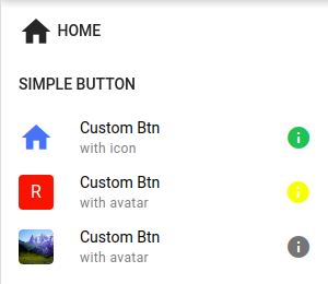
This menu item can create both an Icon and an Avatar Quasar Component.
Bellow we have three JSON that represents the buttons in the image.
# Icon
{
  "title": "Custom Btn",
  "icon": {
    "name": "home",
    "size": "md",
    "color": "blue"
  },
  "caption": "with icon",
  "target": "blank",
  "sideIcon": {
    "name": "info",
    "color": "green"
  }
}
# Avatar
{
  "title": "Custom Btn",
  "avatar": {
    "content": "R",
    "rounded": "true",
    "size": "md",
    "color": "red",
    "textColor": "white"
  },
  "caption": "with avatar",
  "target": "blank",
  "sideIcon": {
    "name": "info",
    "color": "yellow"
  }
}
This example has a rounded border square and a text content.
{
  "title": "Custom Btn",
  "avatar": {
    "img": "https://cdn.quasar.dev/img/mountains.jpg",
    "rounded": "true",
    "size": "md",
    "color": "red",
    "textColor": "white"
  },
  "caption": "with avatar",
  "target": "blank",
  "sideIcon": {
    "name": "info"
  }
}
This example has an image places at the left.